
SHUTTLEFALL
Senior Year Student Team Project at DigiPen Institute of Technology
Roles: Design Lead, Narrative Designer, Narrative Content Designer, Writer, Gameplay Systems Designer, Level Designer, UI Designer, UX Designer, User Researcher, Technical Game Designer.
Tools: Unreal Engine 5, Figma, Krita, Google Docs, Jira, Perforce / Helix Core.
Skills: Emergent Storytelling, Environmental Storytelling, Creative Writing, White-Boxing, Gameplay System Design, Game Feel, UI Wireframing, Blueprinting, Design Iteration, Playtesting, Concept Art, Set Dressing, 3D Modeling, Lighting.
Genre: Rogue-like "Sit and Survive" esk Horror Experience similar to games like Lethal Company, Iron Lung, and Five Nights at Freddy's.
Target Audience: Fans of Rouge-Likes and Horror games, those driven by Game Mastery, and player's who enjoy Immersive Ludonarrative focused Storytelling.
Ludonarrative Cohesive Design
On SHUTTLEFALL, I played the role of Lead Game Designer, focusing on crafting a cohesive experience which reinforced the intended emotions and direction outlined by our game's Creative Director. From Level Design to UI, I designed, tested, and iterated on many elements of the game to work towards actualizing SHUTTLEFALL's creative vision. Below, you can see my approach using all the game's elements for creating emergent storytelling, world-building, tutorialization, and creating interesting and engaging scenarios for the player.

The Manual
Diagetic Onboarding and Tutorialization

Our Biggest Hurdle
From a design perspective, how the player learns the core game loop during their first mission was easily our biggest struggle all throughout the development of SHUTTLEFALL.
Early prototypes of the game featured a written out series of instructions presented to the player immediately as they began the game, as accessed from the game's central point of interaction, the Shuttle's Command Terminal. While this solution literally expressed directly to the player what they needed to do, it wasn't easily digested by players, and many never found it in the first place.
I joined the team shortly after these initial prototypes, and I began working on the title by conducting extensive playtesting. While I was learning how the game worked, and the intentions of the development team, I was just as concerned about what the player experience actually was, looking for common trends and pitfalls, with this tutorialization conflict of course being one of my most jarring a recurring notes.
Our Creative Director wanted to see the existing tutorial moved into an Operation Manual that would be found inside the Shuttle Level. With that, I started researching and writing early iterations of the manual, primarily using Figma both to collect references, write notes, and to create the actual manual pages to be exported into the game as images which would be projected onto physical pages the artists were working on.
Almost every week I was working to get an updated iteration of the manual playable in the game for the next build, that way we could continually playtest changes, and respond to notes in feedback, to get a little bit better every week.


Design Challenges
One challenge of designing the Manual in particular was figuring out how to balance the feel of reference manuals with the more succinct and immediately accessible needs for writing in our game.
If any paragraphs were too long, players would stop reading them. While some of that came intentionally as we wanted to make the manual feel intimidating at first, so intimidating that the player would put it down and avoid it wasn't useful to us. I tried a variety of tips to help guide the player through the book such as Written in Notes, Highlights, Keys, Playing with the Organization of Information in the Book, and adding a series of Sticky notes both inside the Manual and around the Shuttle to build on details within the Manual. While individually each may not have done too much, together they help move the player through the information in a guided and designed way.
The other benefit of guiding the player around the dense book was that room is left for world building. Little notes like copyrights, terms of service, years, references to previous manual editions, and space to further establish the tone of the evil corporation authoring the manual (which enslaves the player) and to establish bits of tone for previous Shuttle Operators by their notes interspersed throughout the manual contents. This is extra space would help me illustrate history while maintaining a similar tone to what the original terminal manuals once offered that felt cohesive and logical within the game world.
Other things we had to play with to develop the manual were the actual visual designs of the modules on board the Shuttle. The Repair Tool was once a pretty big problem during playtesting. When I first came onto the project, the Repair Tool was both never locked, and appeared to be more gun shaped in it's silhouette. As these elements originally made the Repair Tool stick out like a sore thumb, and be immediately accessible, many players would pick it up, and assume the game played more like a first-person shooter.
While the direct gameplay of using the repair tool went unchanged, pretty much every other part of it did. The visual design was radically changed to create a less assault weapon-esk look, and while just as much added to convey repair progress, the Progress Meter Display was added which helped too to express what the tool was actual for and how it worked, which the Manual could now also more easily describe since the visuals were easier to parse into diagrams and step by step instructions.
However, arguable the biggest change to the tool, is that we locked it from the player at the start of the game, and left the answer for how to unlock it in the manual! The appeal of this idea was that we could keep the item in the space both to help guide the player's attention, and to get them interested in what it was, without wrecking the immediate tutorial progression with too many affordances at once. Now the player would see a thing in the space and think: "I wonder if the manual might tell me more about that".
One more challenge was figuring out how to best support the needs of our small art team. The model of the Manual we used in the game was rigged and animated, and the UV sheets for the each page were difficult to remake. What I found early when putting the first iteration of the manual pages into the game was that the pages were going to get stretched and cut off by the spine at the center of the book.
As opposed to spending art resources to change the model, I set up my Figma project to work around the problem, keeping the placement of the spine in mind, as well as how the pages would be scaled. And in the final game, you would never be able to tell something was wrong!


Manual Gallery
This is a gallery of some of the manual iterations I wrote on the game. From iteration to iteration, you can see how the design changed over time to adapt to the needs of players better based on rapid feedback from playtesting. You can also overtime see how iterations began to change visually through collaborations with the Art Team.
Iteration 1


Iteration 3


Iteration 6


Status Indication Lights
Diegetic Communication Designed to Support the Needs of All Players

Diegetic UI Doesn't Come Without Challenges
As you might have gathered from the previous breakdown of the Operation Manual, a good amount of my role on SHUTTLEFALL was about taking the core experience which existed, and tweaking the game design to make it more inviting for a wider audience, but without removing the heart of the game that gave it it's identity. As a designer, I am most passionate about the interactive and emotional storytelling only possible by the ludonarrative elements exclusive to the video game medium, and those values were core to our team as whole, and so our goal to prioritize diegetic UI over non-diegetic UI was a natural extension of these values.

SHUTTLEFALL uses a variety of industrial indication lights to help communicate the status of various equipment during a mission. These lights use color to communicate different status's, originally as shown to the right. However there several notable problems with this design.
For one, the color Red being used to communicate that a machine lacked power isn't the most
consistent idea in the game, as Red is also the color used by an overhead emergency light which begins to flash when the threat of the Alien monster becomes dangerously close to the Shuttle. Likewise, as I became aware while having the opportunity to collaborate with an ex-Navy Concept Artist on the game, the color choices being used here, were inconsistent with what similar real world machines might use to communicate the same or similar ideas.
The most significant issue though which we identified with the design however was that to those who suffered from red green color blindness, distinguishing between the colors was nearly impossible, which severely impacted the ability for this audience to experience our game.
Reworking the Color Codex
The first of the two kinds of problems I identified on the lights were that the colors of the lights were problematic, both because they were used consistently, and because the weren't accurate to real world equivalent.
As I was fortunate enough to be working along side someone experienced with operating similar enough real world machinery, I seeked his assistance for advice on what colors to use and common designs visually for how these might look as well.
The major significant change that came from this rework was the introduction of the Orange Standby Light. Machines now have the light turn off altogether while the machine has no power, and the light will become Orange when the machine has power but requires player input of some kind to run. What this does is enable us to keep the Red light for emergency signaling, now letting us be very consistent with the meaning of that color in the game. In retrospect, I would certainly argue that while the color choices created consistency and better authenticity, I would also say the difference between orange and yellow can be difficult to distinguish, and likewise the difference between orange and red. I feel that with more time, this is something I wouldn't might hitting with another pass to further distinguish between the colors.
Below, you can see the design documentation I wrote to illustrate this redesign.
One note as well as that you may notice is the Purple light listed here, which does not appear in the final game. Gas Leaks never were an actual mechanic in the game, but what I knew as a designer and a writer was that if we told the player it was a thing, the player would assume it to be true. Many early versions of the manual featured the Purple Light in the manual, which both artificially added stress to the player as players would assume there was even more to watch for than there really was, and the inclusion of notes like this which were not accurate to things actually in the game (of which this wasn't the only one), were part of a cut narrative idea, where the manual given to the player was meant for a slightly different model of Mining Shuttle than what the player was using, further reinforcing how little care the company the player was enslaved by cared for them.
The idea was later cut after playtesting suggested the idea was creating more confusion about the scenario than it was building out the world of the game for players.

Designing for Color Blindness
How to accommodate for the accessibility needs of those with color blindness was a difficult problem considering the design direction of the game. An important pillar to me as a designer is that accessibility should not be an after thought or band-aid on the player experience, rather the game should be designed as best it can be with considerations for it's audiences in mind. That's not to say options for color blind accessibility would have been a bad answer, but that I believed that a solution within the raw design of the game itself which accomplishes the same needs would be a stronger an more inclusive solution.
Similarly to the Color Codex solution, my approach involved collaborating with a few other members of my team, for insight on their perspective and experiences. Two of the programmers on the team of our game experience Red Green Color Blindness themselves, and so bouncing ideas off of them and hearing their ideas and playtesting ideas with them proved irreplicable.
With the support of my teammates, I designed a solution which created a secondary way of identifying the different lights. At first, we considered utilizing a multi-light design, which would stack different colored lights on top of each other similar to a stop light, which would allow the player to use the position of the light to diagnose which light is active, even if the specific color illuminated would be difficult to identify. The problem with that design is that it felt out of place with our aesthetic, and took up too much space in our purposely cramped play environment. Correcting this would also take up a great deal of our already heavily strained art budget, which made pursuing it further largely irresponsible. We felt that maintaining the look of our lights was important to the players’ experience, so I began experimenting with the idea of light patterns to create a unique trait to each of the different light colors. Originally this would be an animated effect, similar to the way a lava lamp might look, but the problem with that idea was that our post processing dithering shader matched by the size of our light would likely make it very difficult to parse the details, resulting in much the same outcome we started with.
My teammates liked the idea of playing with patterns, and suggested the idea of instead adding a pattern effect to the color, perhaps creating a flashing morse code inspired effect to the light which could bridge the gap to creating something recognizable, and while the visual could be overlooked in other games, our instruction manual could be rewritten to point the player to that detail, and emphasize it as being a means to gather information.
We decided to add some rules to the idea, with each pattern being limited to three blips per sequence, and we further illustrated that some states should break the rules to create a sense of comfort and to add significance to the lights which observe the more expressive lights.
One of the decisions made here as well, is that we wanted to rely on the light patterns to draw emotion out of the player, rather than having them parse words from real world morse code. This supports our gameplay loop better because it allows us to more quickly communicate with the player since our game relies on quick reactions for the player to stay safe.
Any details which real words that come through the patterns are entirely coincidental and reviewing the patterns to ensure that they either don’t mean anything or mean something that reinforces their significations would be a logical network for improving the design.
As one last additional note, I also implemented the first version of the effect myself, and so what you see on the right of the screen is my actual programming work on the indication lights.
The Shuttle Level
Designing a Space to Create Orchestrated Chaos

How the Shuttle Came About
The Shuttle is the main play space in SHUTTLEFALL. Each day's mission takes place inside of this space, and so the level design challenge on the game wasn't so much about creating moments in the space to craft unique levels with the space, but was more so creating a chaotic but logical space to support the player interacting with the unique scenarios being created by the overlapping game systems.
The Shuttle's design, originally designed directly by our Creative Director, was left untouched throughout most of Production on the game, but as we moved in Post-Production, and shifted our focus on polishing the game, I took up responsibility for reworking the Shuttle into a design that could better facilitate gameplay, and better support guidance through the game's tutorialization.
White-Box Gallery


The new design of the Shuttle was drafted on a white board as a collaboration between myself, our Creative Director, and one of our professors (as SHUTTLEFALL was developed as a student game). It was a unique design process as while the other two were working out ideas on the Whiteboard, I was on my laptop in Unreal, building the space as they were working out the ideas (with plenty of my input of course). While I don't have a picture of that whiteboard sketch, below is a look at the blockout of the new Shuttle space, which I completed during this one design meeting, about 2 Hours in total.
Some of the things we were focused on with this new design was creating iconic feeling locations that separate out the different things the player interacts with in the level, so they can create vivid mental images of what things look like, and where they are. The space was also redesigned here to better create a level flow from station to station, to make completing tasks feel more naturel. That's not to say the clunk was removed entirely, as we still wanted to ensure that the space felt like it was working against the player, and that it invited inconveniences to the player, which would prompt decision making and risk taking. An example of this can be found with the Depositor / Incinerator location, which is isolated, both the furthest away thing on the Shuttle from the Command Terminal, but also from the Breaker, making the decision to Deposit Ore to progress towards the missions goal, coming with a risk since if those seconds of travel time are seconds where the player is completely vulnerable to attacks and module failures.
The Finished Level


We debated as a team many times throughout the early days of this new design as to if it still felt like SHUTTLEFALL to us, and if maybe it had gone too far to streamline the flow of the game. We made several small tweaks and changes past the initial block out, either to add more inconvenience or to create more useful sightlines.
Ultimately, we still weren't convinced, but we put it to play testing anyway, and I really glad we did that, because what we saw immediately was a positive impact on players being able to learn the game loop, find what they needed to in a designed fashion (not to quickly, but too long either. Things were found as they were intended to be found now), and stay engaged much longer.
We had data that suggested those who could get past the first mission would continue to play the game for several missions after that, but those who didn't wouldn't be interested in playing it again. The changes we made resulted in nearly all players getting past the first mission. While it took some convincing, the results of our play testing told us all we needed to hear, and went forward with the new design in the game, certainly for the better.
The Mothership Level
Designing a Home Base for the Player between Each Mission

Home Away From Home
The Mothership is the player's home base in between missions during the game loop. Here the player can purchase items, progress towards one of two ending scenarios, and sleep to begin the next day.
The first step of my level design process is looking reference images and researching practical elements of the space as well as considering gameplay opportunities and design challenges. With all of those thoughts in mind, I do a top-down sketch of the space on paper, which will later guide my white-box of the level.
To the right are a few of my initial sketches for the space.
A challenge for designing this space was making sure to maintain a cohesive visual presentation with the rest of the game, while trying to create a space that felt like a reprieve for the player. I accomplished this by utilizing a brighter color palette that clashed against the cold and dark Shuttle interior. I also equipped the mothership with more updated technology than what's in the Shuttle level to help further sell friendlier and more inviting nature of the Mothership space. This then also reinforces that the antagonist company to the player, Titania Inc., has really set the player up to fail during each mission, and they may have the resources to provide better for the player, but seemingly have little value for them and choose not to.
Another challenge for the level was player guidance in a non-linear space. Since this level was designed for the player to enter from multiple angles, where the player may want to do different things during different visits, the space had to be built so the player wouldn't get lost, and would always be well oriented. To achieve this sightlines towards important interactable elements like the SpaceyBay item shop are designed to be easily seen from every entry point, then also being able to serve as something like a landmark in the space.
After my initial sketches, I moved into Unreal Engine to start working on the white-box of the level in a timely manner which can enable playtesting of the space as quickly as possible.
Bellow you can see screenshots of the quick finished White-box of the level, fully added to game and set up to be played in only a few hours!
You can click here to visit my Rapid Level White-boxing Page to learn about how I practice speed and efficiency during the White-boxing process.


White-Box


First Art Pass


The Finished Level


The Drill System
How an Iconic Silhouette can Change Everything!

Creating Iconic Self Tutorializing Looks
Particularly with the Drill, in early play testing, testers had a difficult time identifying what it actually was, despite mining being the main operation of the gameplay loop.
Originally the Drill head was implied to be on the outside of the Shuttle, and what was inside the Shuttle instead was a drill output station, where resources would once mined up. During this time as well, the Drill, along with the Refinery, was entirely controlled by the Command Terminal.
As I was working the Operation Manual, and overhauling game tutorialization in general, I wanted to take another look how the Drill actually looked and worked, as I saw opportunity there to one create a more interesting gameplay interaction, but also on with lots of visual feedback, that almost tutorialize itself (of course with the Manual's help as well)!
I collaborated with our artists to design the new look of the drill (you can see my concept art to the right). I wanted the player to be able to step into the Shuttle, and immediately see the Drill, and be able to tell it was a Drill. As the Drill head is the most identifiable part of it, I proposed that we should bring the Drill head inside the Shuttle, and manually lower it into the earth with gameplay. This idea would also then establish the leveler mechanic, not just to raise and lower the Drill head, but specifically to do so directly from the Drill instead of through the Command Terminal (and then later working with our programmers to get the feel and timing of pulling the lever to feel just right)!
Other changes occurred similarly with other modules, and what these changes provided was more iconic visual designs which could be referenced easier and depicted in diagrams through the manual so that the player could more easily identify what and where the Drill actually was. Now, when you enter the Shuttle, it is undeniably the first thing the player will see, and the design tells the player exactly how to use it too!


Drill Module Rework - Design Documentation
Written by me
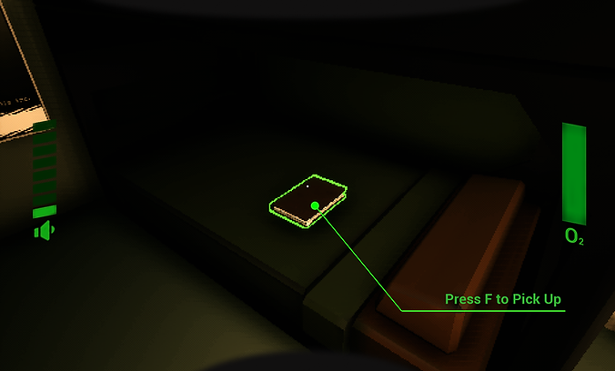
The Oxygen System
Building Systems to Solve Problems in Gameplay

Creating a Sense of Urgency
As I continued to conduct regular weekly playtests on SHUTTLEFALL, one thing became evident, despite mechanics like overheating and the constant threat of the Alien monster, there was a consistent optimal strategy developing amongst playtesters where working slowly, handling one task at a time, and avoiding risky situations, would always allow the player to safely complete each contact.
As we wanted a messy and chaotic play experience for all players where they would need to engage in dangerous choices, it became clear that we needed a time incentive to encourage the player to move quickly during contacts, with failing to do so resulting in significant consequences.
I set out to design a system to make the player play the game faster and less precisely. The challenging part of this was that we were quickly approaching the end of production on the game, and resources would be very limited particularly from art.
Understanding that the most cost effective way to solve the problem would be a solution that could be done without needing the art team's support, the concept of a constantly counting down oxygen meter was chosen as it could entirely be communicated through the HUD I made, and SFX.
The Oxygen System has two timers at play:
-
The Shuttle's Oxygen Reverse (which is spent over the course of a mission)
-
The Operator's Oxygen Reserve (which is spent when the Shuttle's Oxygen Reserve is elapsed or disabled, which occurs if the power break is off. Game Over will occur if the Operator's Oxygen Reserve is elapsed)
To determine the duration of each oxygen reserve, I conducted specific playtests with blind play testers, to learn what the average time it would take a new player to get through the first mission, and to learn how long it takes a new player to find the breaker if power goes out on the Shuttle.
These results then provided me with what the the durations should consider, and so the final timer's are built to create a safe but stressful time incentive, but one that can easily be beaten by smart play.
A Breakdown of Resource Flow

The Updated HUD Design with O2

Suffocating in Motion
Junk Items and Incineration System
Adding Consequences that Make the Player Pay Attention

Adding Complexity
There was some irony during the early days of SHUTTLEFALL's development, as while playtest results were expressing that player's were struggling to learn how to play the game, there was actually a different problem entirely being masked by that data. The actual gameplay loop was way too simple!
Sounds pretty crazy, but for the player's we tested with who were able to pickup the gameplay loop, the actual gameplay was too simple to stay engaging for long durations and multiple missions, and as my changes to tutorialization were getting implemented, and more and more player's were learning the gameplay much faster, the bigger this problem was proving to be.
Luckily for us however, we started responding to this as soon as testing results started to show it. While I'm not responsible for every added system onto the core gameplay loop (such as Overheating, Whether, Guess Game, Selected Contact Locations, etc.), one I am responsible for is the Junk Item, and associated Incineration System.
Besides time being lost (which at the time, the Oxygen System didn't exist yet, so that wasn't really a problem), either of the two ways mining could be interrupted in the game (power loss or overheating) didn't have a consequence to the player, it was just more of an inconvenience. I solved this by adding a high chance that if mining is interrupted in any way, the player will mine up a junk item instead of ore. The key though is that it's a chance, so a player in a tough situation certainly can risk it (which is another idea the manual helps us communicate).
So you mine up junk, but what do you do with it? I added a caveat onto launching the Shuttle that it actually can't take off with excess weight on board, A.K.A, junk items. This means that the player would need to dispose of it in some way, which is where the Incinerator comes in.
The Incinerator is a secondary mode of the Ore Depositor, created originally from repurposing assets from elsewhere in the game. While the manual fully explains the purpose and flow of junk to incinerator, we thought it would be interesting to let the player accidently incinerate other things too. This intentionally creates some failures for the player as they learn the game, but does so in a way where the player sees something clearly go wrong, and will turn to the manual to find an explanation for what had occurred. There are some secret's tied to this that will impact the End Game Stats as well!


Junk Item and Incineration System - Design Documentation
Written by me
The SpaceyBay Item Shop
Bringing Ebay to SHUTTLEFALL

Designing a Diegetic Item Shop
When I began working on SHUTTLEFALL, while the plans existed for the game to become a rogue-like experience, at the time it was only a prototype featuring one mission, and the game ended once you safely returned from that mission. That said, our Creative Director had plans for an item shop to facilitate the games meta progression elements, and they had also already put together and inventory system of sorts for the Players' Mining Shuttle, being the Cargo Bay.
So where I got involved then was designing the shop side of the system, both in how the system would work, and what it's interface would look like.
The first step of that process began with designing the system. While I'm not responsible for the economy in the game, I did work with our Creative Director to work out how the shop would reset (between each day), and that purchases would be provided directly in the Shuttle's Cargo Bay.
With that I then used Figma to quickly put together a mock-up of my idea for the interface. We knew we wanted the shop to appear on a computer terminal in the Mothership Level, and specifically so with notably upgraded technology compared to what was in the Shuttle. Key elements of this would be the inclusion of Mouse Control on this display, as well as a fidelity targeting Windows XP. Below, you can see my first iteration of this design.
Iteration 1
Designing Iteration 2
That first iteration was cool but pretty drawn out. In my effort to be authentic to how starting a machine like that would work in real life, I made something that would get pretty annoying to experience repeatedly throughout a playthrough. From that I made the decision to have the display always on, so when the player goes to interact with it, all they have to do is open the shop, get what they need, and leave. That much more streamlined experience made a big difference!
The other changes came down to the shop itself. The shop was called SpaceyBay as play on words of 'Space Ebay'. While the initial design was perfectly functional, it didn't quite sell the style we were looking for, and so I turned to late 90's renditions of Ebay for inspiration. I collected several references and use them to build the updated design we would ultimately go with. I think you could certainly say it feels much more like a 'Space Ebay' now!

Iteration 2
Diegetic Heads Up Display
Using the HUD to Ground the Player Fantasy

Everything is Grounded
Player immersion was one of the most important things to us on SHUTTLEFALL, so how information is communicated to the player becomes a complex, but important problem to solve. Non diegetic UI can be great for many contexts, but for our game we felt it would standout too much from the rest of the game.
Any information should come from an in universe source, and so things like tutorials and narrative exposition are provided through diegetic means like computer terminals and operation manuals. But one challenge then came from how we would communicate information the player would need to be able to see at all times, like how much noise they were making or how much oxygen remains.
Affordances, Signifiers, and Feedback
To keep track of all of the elements of the game, I designed an ASF (Affordances, Signifiers, and Feedback) to keep track of everything we were putting in the game, and so we could then log how each thing would have what it does and how you interact with it communicated to the player.

This (of which the above screenshot is only a sample of) was very helpful! Not only did a large collected list like this help us figure out what we need to come up with answers for keep track of progress, but it also helped us narrow down the ideas which wouldn't easily fit, and would need to worked into a different solution. While things like the Repair Tool I solved with a small display directly on the gun, elements like the player's own Sound Level being made or Oxygen Reserves remaining would need to be worked into a diegetic Heads up Display.
Inspired by Metroid Prime, I designed a heads up display to mimic the interior view of the player character's helmet. In SHUTTLEFALL you play as a Shuttle Operator, and you are implied throughout the game to constantly be wearing a space suit. Similar to Metroid, one the helmet's visor some information is displayed to the player, specifically that information which is tied directly to the player character's suit. This solution enabled us to convey the necessary information to the player while not breaking immersion with otherwise intrusive non diegetic elements.
Another challenge was figuring out the actual visual look of the helmet interior. Too much detail could make the visor look too high tech or too obtrusive from game play. I tried several variations of shapes inspired primarily from Lethal Company, some even with different visor tints and UI indicators.

The one we ended up going with for the game is very minimal list with helmet shapes only on the top and bottom of the screen as to no interfere too heavily with the player's field of view. The Noise and Oxygen indicators are vertical and one either sides of the screen, this way they can still be seen even while the player is interacting with modules or reading the Operation Manual.
Opening Crawl
The Introductory Exposition to Set the Tone for the Experiance

Setting the Tone
How the player is first introduced into the world of the game is something we thought was important.
We knew our game had a lot to onboard the player to, but we also knew that exposition before the player has any real context of the game will likely be forgotten or not stick with the player in a meaningful way. This being said, we felt that starting with something before live gameplay would be important for correctly setting the tone.
Those ideas created a challenge for how to start the game. To solve this, I wrote this brief opening text crawl. While short, what this does is establish the cold and uncaring relationship between the player character, and the company they work for. A few instructions for what the player should be doing are also provided here, though they are there primarily to contextualize the crawl. The level design on it's own carries the actual tutorial, letting this text focus on setting the tone for the game.
The Diary and True Ending
Secrets that Reward the Deep Dive

How to End our Rogue-Like
SHUTTLEFALL features two different endings. The first ending is achievable after completing 2o missions on easy and normal difficulties, and 50 on hard. If those numbers sound outrageous, that is intentional. I wanted the player to feel like what they were being tasked to do was near impossible. Perhaps instead of following instructions, there's another way out?
The true ending to SHUTTLEFALL is both much easier to reach and hinted at throughout the game.
Discovering the Hidden Ending
In the Sleeping Quarters of the Mothership, the Player will find a Diary left behind by another Shuttle Operator. I chose to use a Diary as the communication devise because we largely could reuse assets from the Manual to make it, and pages likewise could be made easily in Figma.

The diary chronicles the experience's of this other operator. This in general helps me as a narrative designer frame how the player feels about the company in the game, since I could use this book to whisper sweet nothings directly to the player. But the real key note of the diary is that it updates over time. After each mission, the player can return to the Sleeping Quarters to find new journal entries left by this other character, sometimes even referencing the player directly, as over time they will start to leave the Player specific notes or instructions about how to escape.
Below is the first draft of the entire content plan for the true ending, and how the diary would be used to set it up (created in Figma).


There were a few problems that stemmed from the plan outlined there.
For one, it would require an additional level to be designed. On paper, me making an additional level isn't all that difficult (in fact, I actually did make a white box for it), but not only would another space generally be expensive to polish, particularly from the art team, it would have also been our first and only exterior space in the game. That would have invited many new challenges. What would the Shuttle Exterior have looked like, or how would we hide holes in the ground plane we cut for technical reasons?
Secondly, there would have been a lot of pretty complicated things to teach to the player, especially since they were unique interactions. Even if they would have been feasible to implement, if the player didn't understand what to do, especially when failure could end a playthrough, resetting all progress, it didn't really accomplish much.
So, with those thoughts in mind, I, along with our Creative Director, Tech Director, and QA Director sat down and iterated on the design. We put together a new similar ending that used SHUTTLEFALL's existing gameplay to create a boss encounter, and we seeked to assistance of a student art outsourcing team to create a specific exterior space to appear in a brief cinematic to help alleviate some burden from our artists.
The ending would reward good play. Success would be earned by those who followed the diary's notes and used the in game shop to create strong and viable builds around speed and low heat (example to the right).
The final diary entry would explicitly spell out a brief list of commands that the player would need to type into the terminal, and would only work if a series of specific items were equipped. Of course a challenge here would be finding the line of making the instructions clear to the player while maintaining the correct tone of voice and immersion with the player. The text in the diary was outlined by me, but written originally by one of my fellow teammates. That said, the final editing pass on the book was completed by me based on play testing notes to make sure all players could reach SHUTTLEFALL's final enocunter.

The Final Boss - Design Documentation
Written by me
End Game Stats
Turning Development Tools into Front Facing Features

The Power of Playtesting
As you may have gathered from many of my notes, playtesting was really biggest influence on any of the design work I did on the game. My work wasn't so much about manifesting ideas from thin air, as it was making observations of player behaviors or quirks in systems, and using the data to create solutions.
Towards the end of production, I worked with a programmer on our team to implement a series of telemetry systems to help us collect data during playtesting sessions (with player approval of course).
At some point I had had the idea of using that same data to create a results screen at the end of the game, which would display select information about the player's playthrough. Inspired by a few different games, but most notably Silent Hill 2, we thought it would be fun to turn our playtesting system into a practical results screen.
While perhaps not the most complex addition to the game, I thought this was a creative use of existing resources, and an interesting way to feature effort which otherwise wouldn't directly be seen in the game into the final product. But the other thing it does, is communicate to the player things they might have missed in a playthrough, prompting them to replay, and search for hidden things and new strategies.
Below you can see the way these stats are displayed at the end of a SHUTTLEFALL playthrough.

Silent Hill 2


